Ad Campaign 2.0
The Design Block – Art Director
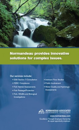
When initially taking on this project with Normandeau, we noticed that hydropower service provider ads were all the same, and very bland. For the first series, we chose in-the-field imagery and added a bold secondary brand color to help set Normandeau apart.
After running for about six months, we started to see a shift in their competitor’s ads becoming a bit copycat-ish. So with campaign 2.0 came bolder headlines, more saturated colors, conceptual imagery, and slimmed down copy—highlighting the bottom line of what they do—further separating them from the crowd.